
What Bold Color Trends Are Popping Up in 2025 Spaces?
Interior design in 2025 is experiencing a chromatic renaissance. After years dominated by neutral, minimalist palettes, there’s a vibrant shift towards richer and more expressive hues. Homeowners and designers alike are craving spaces that feel alive with personality. From bold saturated colors making a comeback to surprisingly stylish color pairings, the year’s emerging palettes reflect a desire for warmth, comfort, and individuality.
In fact, 2025 is shaping up to be “all about rich, saturated hues and surprising color pairings” that bring fresh energy into our homes. Color trends aren’t just aesthetic whims. They mirror cultural moods and can instantly transform the ambiance of a space. Below, we explore the standout color directions of 2025 and how you can artfully weave them into your own home.
Frequently Asked Questions (FAQs)
Q: What are the top color trends for home interiors in 2025?
A: In 2025, interior colors are getting bolder and warmer. Designers highlight deep, saturated hues (like dark purple, rich brown, and wine red) as major trends, often balanced with earthy neutrals. Unexpected color pairings (such as yellow with blue, or plum with green) are also popular, bringing fresh energy to spaces.
Q: How can I add bold colors to my home without repainting everything?
A: Start with small accent pieces. You can introduce bold colors through throw pillows, artwork, rugs, or a single piece of furniture in a trending hue. This way, you get a pop of color without a full commitment. Swapping in a vibrant chair or colorful art is an easy, low-cost way to test a bold color trend in your space.
Q: What is “color drenching” in interior design?
A: Color drenching is a trend where you paint an entire room one color – walls, ceiling, trim, even cabinetry – for a dramatic, enveloping effect. This monochromatic technique, popular in 2025, creates a “jewel box” room brimming with character. For example, a small powder room might be painted floor-to-ceiling in deep teal or terracotta to make a stylish statement.
Q: Are all-white interiors out of style now?
A: All-white and ultra-neutral interiors have decreased in popularity going into 2025. Designers are moving away from the sterile, minimalist look in favor of more personalized, color-rich spaces. This doesn’t mean you can’t use white at all, but layering in some warmer neutrals or a few bold accents will make a space feel more current and alive. The key is finding a balance between light backdrops and pops of color or pattern that add interest.
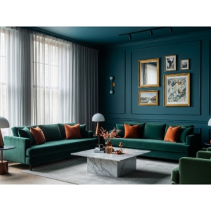
The Return of Deep, Saturated Colors
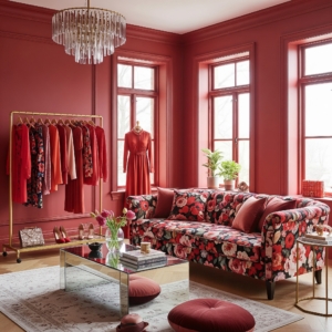
Over the past decade, safe neutrals and whites often took center stage – but not anymore. Deep, saturated colors are roaring back into fashion, infusing interiors with drama and depth. Designers report a “strong move toward richer, warmer tones” following the reign of all-white minimalism. In particular, moody jewel tones and intense earthy shades are poised to dominate. Think dark eggplant purples, luxurious chocolate browns, and deep wine reds enlivening everything from living room walls to kitchen cabinetry. ELLE Decor’s trend forecast notes we’re seeing a resurgence of colors that are complex and “muddied”.
Desaturated greens, muted ochres, and dusty blues that convey a sense of soft power rather than neon-bright loudness. The overarching theme? Bold hues with sophistication and depth. Paint companies are encouraging this embrace of intensity too. Pantone’s 2025 selection of Mocha Mousse (a rich brown) and PPG’s pick of Purple Basil (a regal eggplant purple) underscore a collective shift toward unapologetically bold choices. “It’s time to go bold,” as one color expert put it.
In 2025, vibrant color is not just permitted, it’s celebrated. Homeowners can expect to see spaces drenched in jewel tones or accented with saturated pops that were once reserved for the avant-garde. The result is interiors that feel lush, cocooning, and full of personality.
Unexpected Color Pairings
One of the most exciting 2025 color trends is the rise of unexpected color pairings. Designers are moving beyond traditional monochromatic schemes and experimenting with bold, even quirky, combinations of hues. The goal is to create contrast and visual interest in fresh ways. For example, rich plum purple paired with forest green is emerging as a power duo. In one design industry poll, 44% of experts said this plum-and-green combo will rule 2025.
It’s a pairing that feels lush and daring, far from the safe “matchy” palettes of years past. Another striking mix gaining traction is fuchsia with bright yellow. “Bright yellow brings the energy, and pink brings the party,” says designer Jenna Gross of Colordrunk Designs, who loves saturating rooms in golden yellow with pops of vibrant pink for balance.
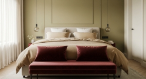
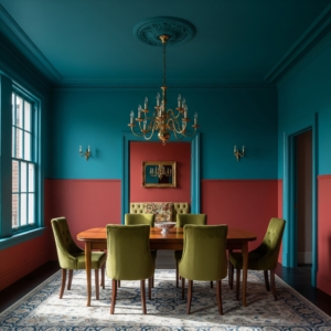
The result is cheerful and avant-garde at once. Even the classic red-and-green duo is being reimagined in sophisticated tones. One designer combined a petrol teal (blue-green) with a beetroot red in a bedroom to achieve a rich, moody elegance that felt anything but Christmas-y.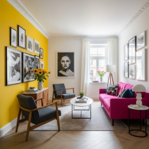
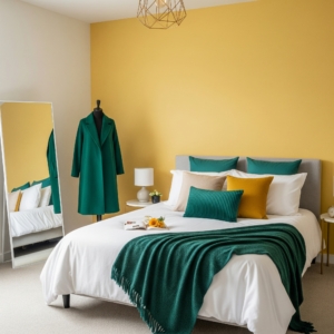
Other unlikely pairings cropping up in 2025 homes include butter yellow with soft lavender, sky blue with cherry red, and even black with brown (a once-taboo mix now seen as edgy and chic). The common thread is an element of surprise. Pairing colors that historically might clash, yet using the right shades to make them complement.
Designers often draw inspiration from fashion runways for these daring combos. As Vogue reported, “yellow, which came back into fashion in 2024, is now being paired with perennial favorite blue” to striking effect (picture a fresh lemon-yellow sofa against a modern cerulean blue wall).
The key to nailing this trend is balance: usually one color takes a dominant role while the other provides an accent or grounding contrast. The payoff for those willing to experiment is a space that feels uniquely personal and visually dynamic – a true conversation starter.
Earthy Neutrals with Bold Accents
Bold color in 2025 isn’t all about saturating every inch of a room. Another significant trend is pairing earthy neutrals with vibrant accents. Warm, nature-inspired neutrals are providing a calming canvas, while punches of vivid color serve as focal points. Think of grounded hues like camel, taupe, clay, and olive dominating a space, accented by a singular bold statement shade. This approach offers the best of both worlds: the neutrality keeps things sophisticated and versatile, and the bright accents inject personality. In fact, Architectural Digest compares the 2025 palette to a stroll through a produce market, filled with the soft brown of a coconut husk alongside the vivid yellow of spaghetti squash – an earthy base energized by lively pops. Brown in particular is enjoying a renaissance as a go-to neutral. “Brown and all of its surrounding shades are back with a vengeance,” notes AD100 designer Young Huh.
Paint brands on both sides of the Atlantic crowned shades of brown (from beige-y taupe to chocolate) as Colors of the Year, confirming the comeback of cozy, organic tones. Pantone’s 2025 Color of the Year, Mocha Mousse, is exactly this kind of inviting mid-tone brown – “sophisticated and lush, yet unpretentious,” chosen for its nurturing warmth and “thoughtful indulgence”. Designers are using these neutrals as a foundation and then adding one bold accent to make the room pop: imagine a living room in layers of beige, caramel, and wood tones with a single teal-blue sofa as the star, or a serene sand-colored bedroom enlivened by bright cinnamon-red throw pillows and art.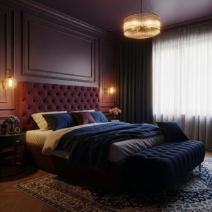
Deep reds and burgundies are popular accent choices on neutrals, offering what designer Christian Bense calls “the unexpected pop of color you’re after, in a more sophisticated, grown-up way”. Even a small dose of wine-red or emerald green against a backdrop of cream or greige can elevate the whole design. According to Vogue, wine red in particular is emerging as a definitive accent hue for 2025 interiors, lending a sensual yet understated opulence and bridging the gap between rich jewel tones and natural neutrals.
We see this in practice with designers swapping out all-beige accessories for burgundy velvet pillows, or adding a singular statement chair upholstered in orange-red against otherwise earthy decor. The takeaway: neutral rooms are far from “boring” this year – they’re simply the grounding element that allows those bold accent colors to truly shine. By embracing warm, earthy neutrals and choosing one or two strategic bursts of color, you can strike a harmonious balance that feels both calming and captivating.
Influence of Fashion on Interior Color Palettes
It’s often said that interior design follows the runway, and 2025’s color trends prove the rule. The influence of fashion on home palettes is stronger than ever. Colors that debut in haute couture collections or streetwear one season frequently find their way into our living rooms the next. This year, for instance, deep burgundy and oxblood reds have been spotlighted in high-end fashion lines (Gucci, Khaite and others sent burgundy down the runway), and now those same tones are trending in our homes. Vogue’s annual design report noted that “as burgundy pops up in … fashion collections, so too is it set to take over our homes.”
We’re seeing that prediction come true as designers incorporate wine-red accent chairs, rugs, and decor after seeing the hue’s resurgence in clothing. Similarly, the “butter yellow” that fashion insiders raved about for Spring 2025 is influencing interior paint and upholstery choices, offering a sunny alternative to basic neutrals. The cross-pollination goes both ways: trend forecasters like Pantone select a Color of the Year to capture the zeitgeist, and that choice guides both wardrobe and decor decisions. (Pantone’s pick of Mocha Mousse.
A brown shade highlights the broader cultural embrace of comfort and nature, in fashion and interiors alike.) Designer Christine Gachot provides a vivid example of fashion-meets-home: she found herself obsessing over an oxblood leather handbag one season and soon began using that same rich, reddish-brown tone in her interior projects. “As design trends often follow fashion, consider introducing Oxblood into your palette,” Gachot advises, noting that this color’s richness and sophistication easily elevate both an outfit and a room’s design.
Another way fashion influences interior color is through unexpected combinations. If a couture show pairs vibrant teal with lavender or tomato red with pink, you can bet adventurous interior designers will try similar daring combos in a trendy hotel lobby or living space. The maximalist color blocking seen on runways (think head-to-toe monochrome outfits or clashing prints) has its parallel in interiors with the color drenching trend (painting walls, ceilings, and trim all in one color) and bold pattern mixing. In essence, both realms respond to the same cultural currents. A collective swing toward optimism, escapism, or nostalgia will be reflected in the colors people wear and the colors they decorate with. In 2025, that mood clearly favors creativity and self-expression through color. So don’t be surprised if your favorite fashion magazine and interior design blog are talking about the very same hues. The line between your closet and your home’s color palette has never been more blurred.
How to Incorporate 2025 Color Trends into Your Home
Knowing the trends is one thing – but how can you actually use these bold 2025 colors in your own space? Here are some design-forward yet practical tips for incorporating this year’s color trends into your home:
- Start Small with Accents: If you’re feeling cautious about bright color, introduce 2025’s hues through easily swap-able accents. Think throw pillows, artwork, vases, or a single accent chair in a trending color. A teal pillow or a few purple accessories can energize a neutral room without a big commitment. You can always add more if you love the look.
- Embrace Color Drenching: For a more dramatic update, consider “color drenching” a space – painting the walls, ceiling, and trim all in the same saturated color for an immersive effect. Designers say this all-over approach can transform a room into a jewel box. A powder room or study, for example, could be cloaked in deep blue or terracotta for a chic, cocooning vibe. If that’s too much, try painting just one accent wall or the ceiling in a bold hue to start. Color experts note that whether you drench an entire room or simply create a restrained “color moment” on a fireplace mantel or bookshelf, strategic use of color can make a big impact.
- Pair Bold with Balanced: When using striking colors, balance them with neutrals and natural textures. For instance, if you love the fuchsia + yellow trend, you might paint an entryway in buttery yellow and then add a fuchsia upholstered bench – but keep the floor wood tones and adjacent rooms in whites or taupes so the bold area remains harmonious. Mix bold accents with earthy elements like wood, stone, or woven materials to ground the look. This contrast prevents the space from feeling chaotic while still celebrating color.
- Play with Textiles and Patterns: An easy way to adopt color trends is through textiles – rugs, curtains, bedding, and upholstery in of-the-moment hues. Don’t shy away from fun patterns that feature 2025’s palette. Floral drapery with cobalt blue and marigold, or a geometric rug weaving in olive green and purple, can layer trend colors into a room without repainting walls. As one designer put it, “Don’t be afraid of fun patterns and colors on any textile in your space… bold textiles make all the difference.” Fabrics and rugs allow you to experiment with bold color in a less permanent way (you can always recover a chair or swap out a rug down the line).
- Take Inspiration from Your Wardrobe: Finally, let your personal fashion sense guide you. Love the colors of a scarf or jacket you own? Bring those into the room with matching throw blankets or a wall color pulled from that palette. If a certain vibrant shade makes you feel confident in clothing, it will likely make you happy at home too. Browse runway photos or fashion magazines for color inspiration. If a combo or shade catches your eye, try translating it into your decor. This ensures your space feels stylish and authentic to you.
By following these tips, you’ll create interiors that not only look on-trend for 2025 but also feel personal and livable. Remember, color is one of the most powerful tools in design – it can influence mood and character of a room instantly. So have fun with it! Whether you choose to repaint an entire room in a daring hue or simply add a few bold accents here and there, embracing these color trends can breathe new life into your home.
If you’re looking to add some vintage touches to your home, take a look at our last blog on the comeback of vintage touches.
Conclusion
Bold color trends in 2025 are redefining our living spaces – making them more vibrant, character-filled, and reflective of personal style. Whether it’s through the return of sumptuous saturated tones, the thrill of unconventional color pairings, or the grounded appeal of earthy neutrals spiced up with lively accents, this year’s palette offers something for every design enthusiast. The common thread is confidence: 2025 encourages homeowners to embrace color with a daring yet curated approach. As you experiment with these trends, remember that color is deeply personal. Choose hues that speak to you and create the mood you want, whether that’s the energizing jolt of a bright accent wall or the comforting hug of a warm brown living room.
Ready to transform your home’s look with color? Don’t hesitate – play with swatches, gather inspiration from our style guides, and even create a mood board of your favorite 2025 colors.
The beauty of this year’s trends is how adaptable they are: a sophisticated, design-forward interior can also brim with fun and personality. So go ahead and infuse your home with the colors you love. By following the tips and insights above, you’ll be well on your way to a bold, beautiful space that feels utterly you. Here’s to a more colorful 2025!
Happy decorating – and remember, your home is your canvas.